Project
Role
Lead designer
Sector
Financial services
Category
Brand identity
BSP
Bank South Pacific (BSP) is the financial backbone of the South Pacific, serving more than three million customers across seven markets. They operate in a highly complex financial environment and needed to evolve from a PNG-centric bank into a regional leader while reinforcing trust, inclusivity and alignment to their strategy of “Modernising for Growth”. The core challenge was translating the complexity of their offerings into a clear, accessible experience which speaks to all seven markets individually and as a collective.
From complexity to clarity
The Approach
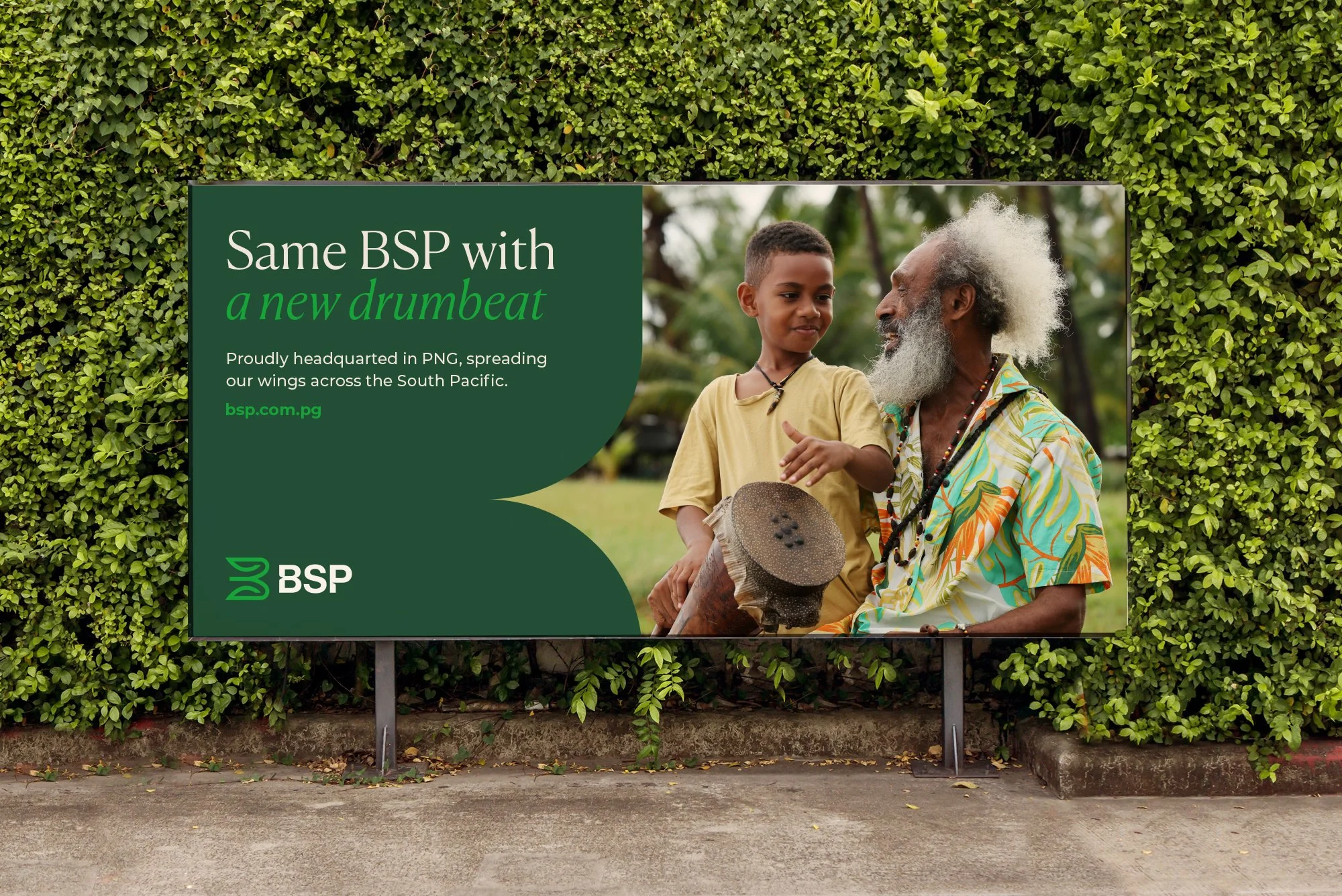
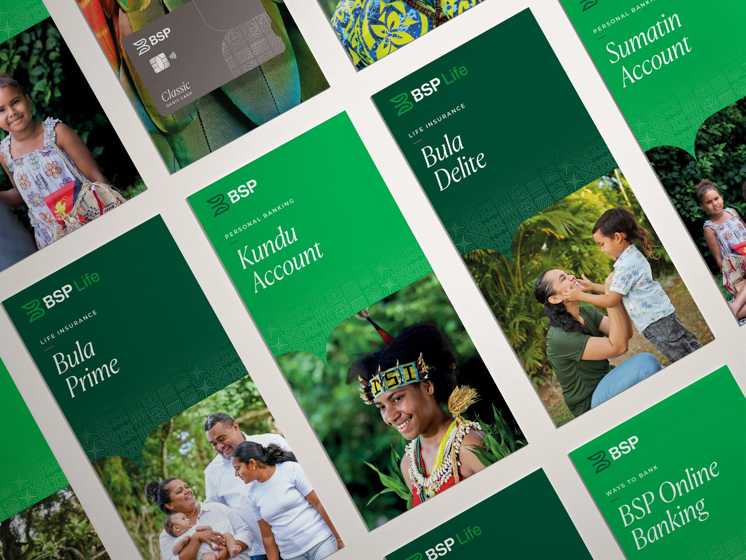
The existing experience lacked clarity, consistency, and a strong point of differentiation. Information was dense, hierarchy unclear, and the overall system lacked cohesion, making it difficult for users to quickly understand the value of their offering. The new identity combines restraint and precision, drawing from financial conventions with cultural references while introducing a more contemporary, digital-first feel focussing on clarity, structure, and scalability.
Simplified visual language to reduce cognitive load
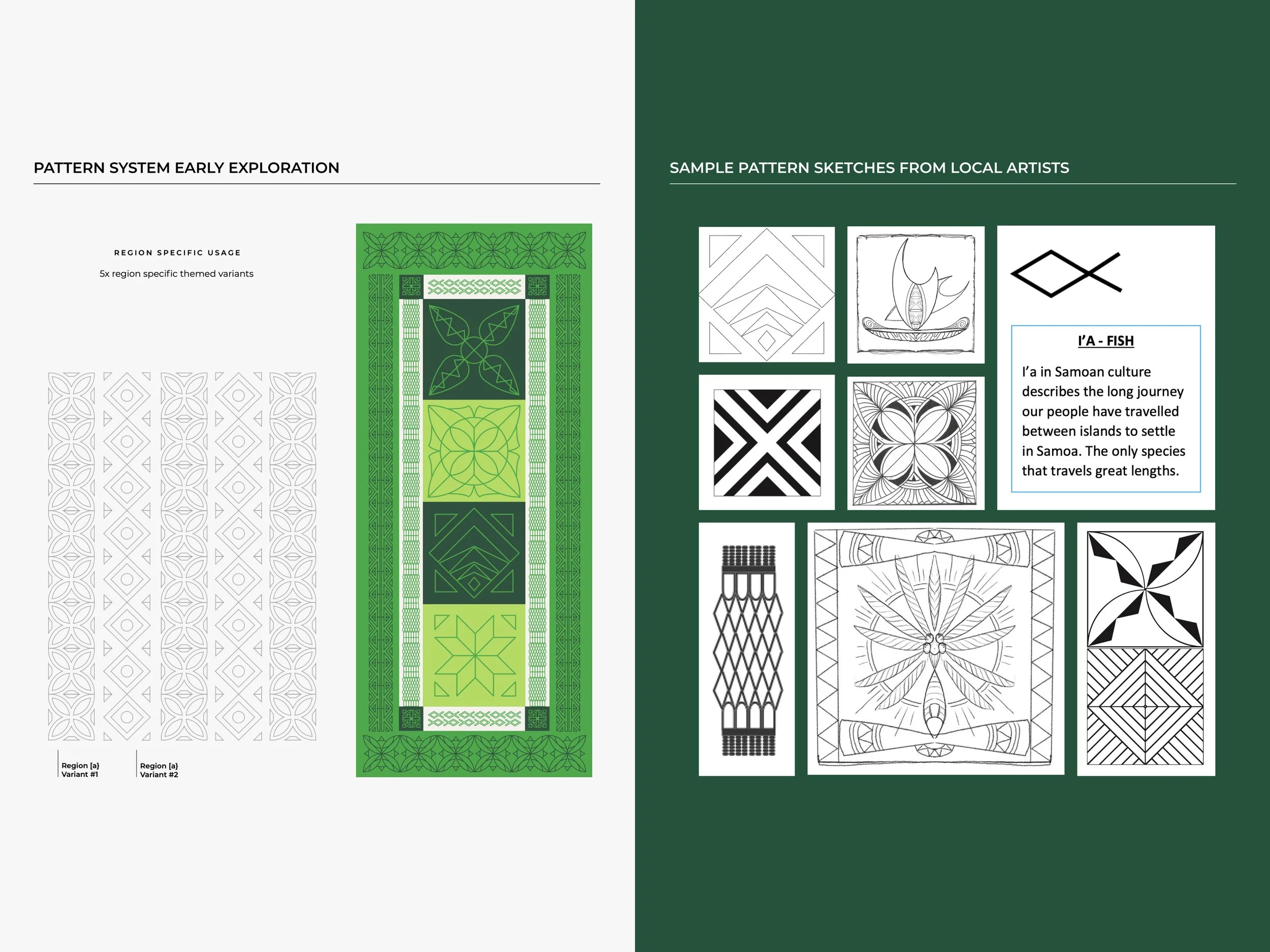
A modular pattern system to support market unification and localisation
Established typographic hierarchy to guide users through complex information
A design system that balances credibility with modernity
Comprehensive range of templates and guidelines to support in-house execution and future growth
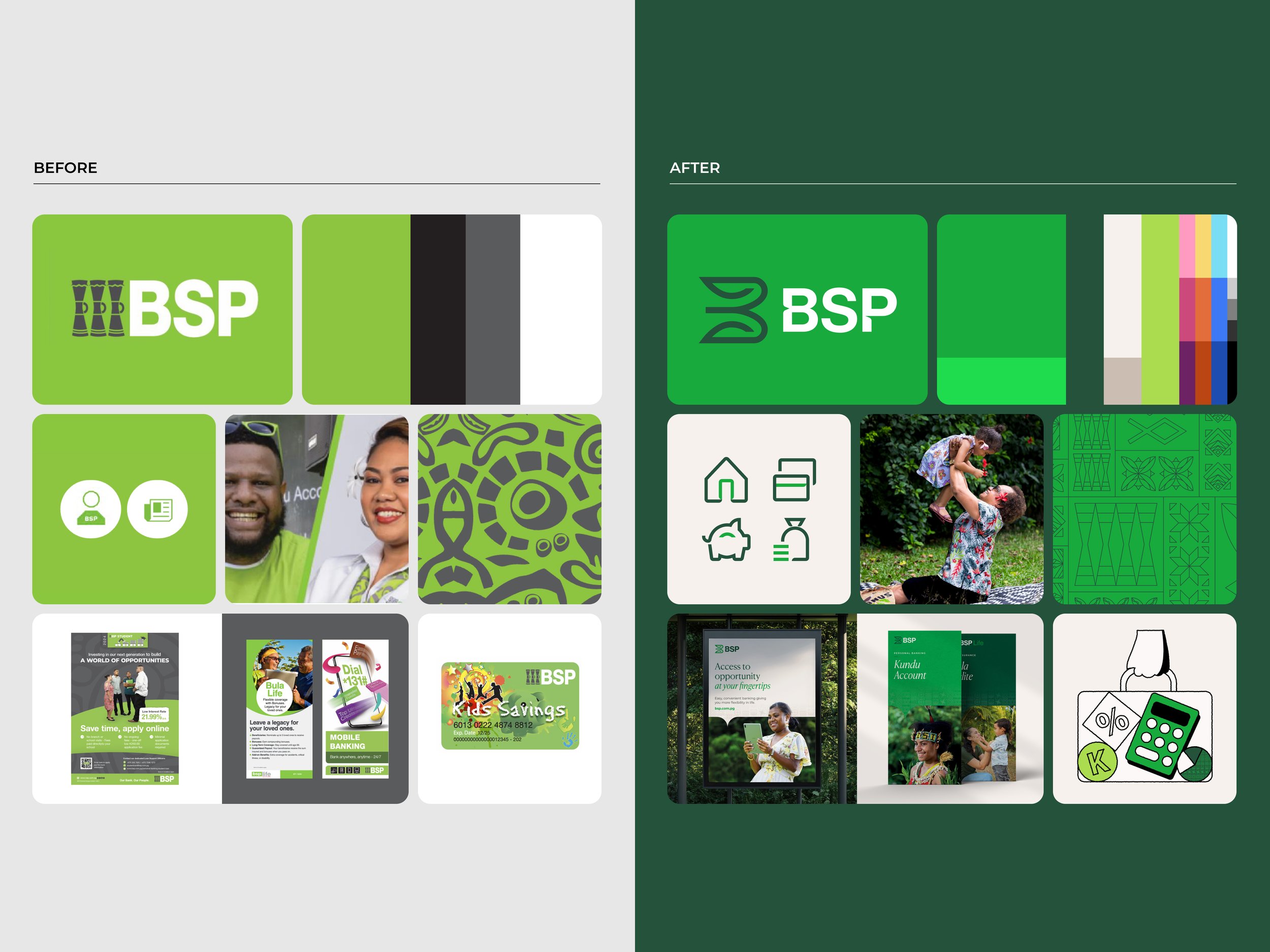
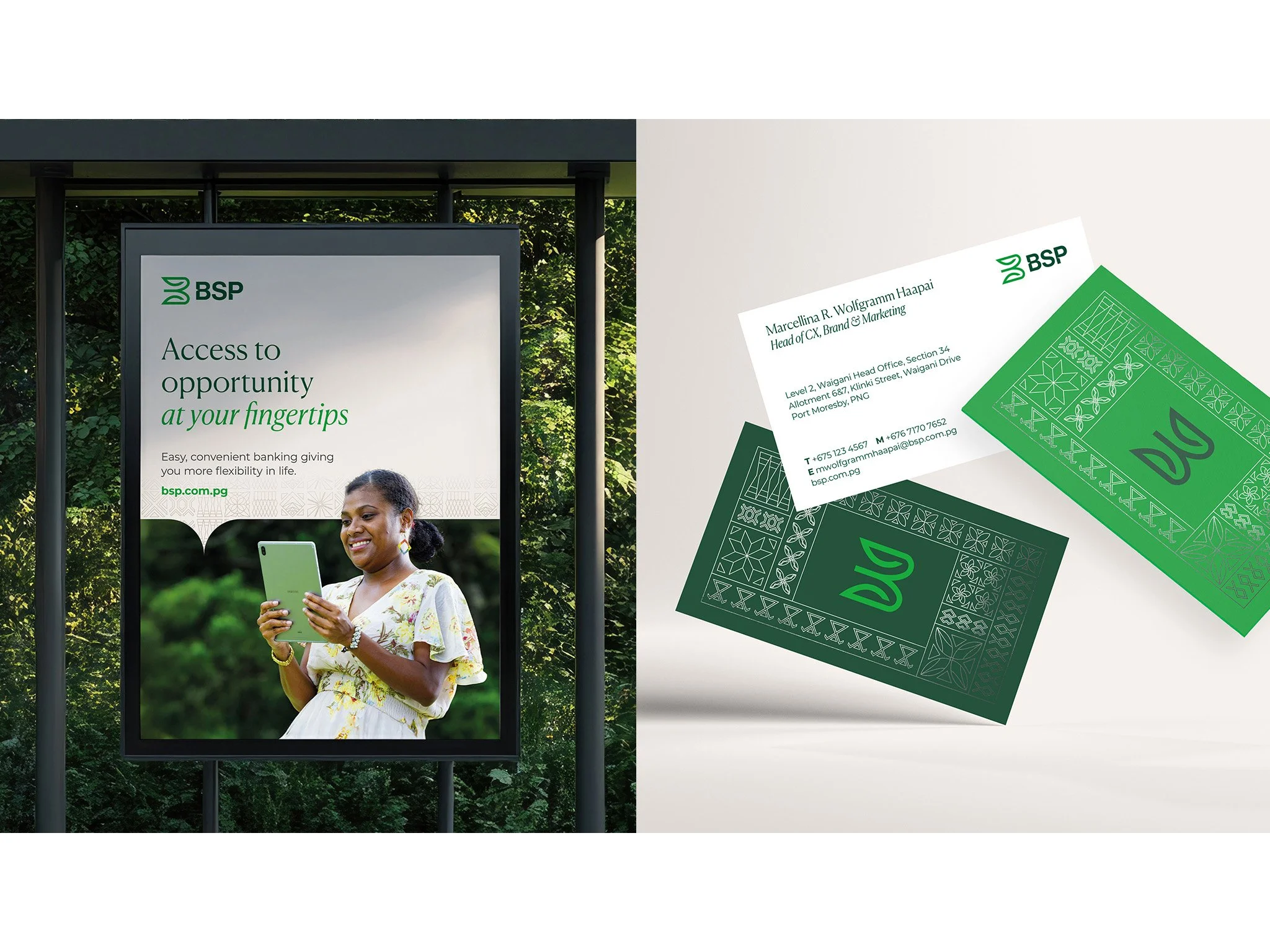
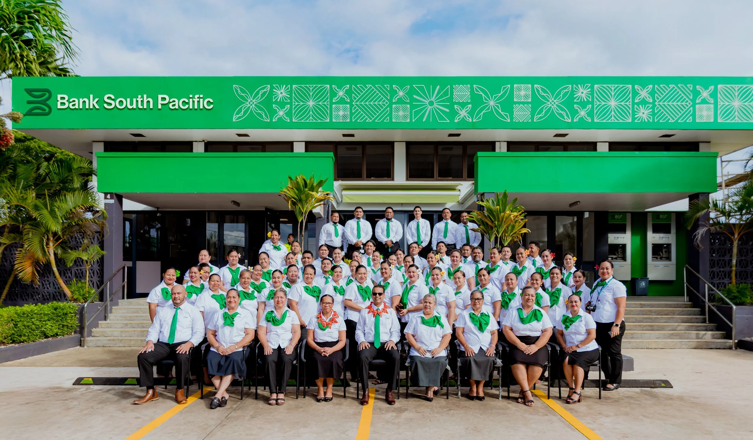
I led the development of the new pattern suite, working collaboratively with each Market Head and a local artist to ensure the new symbols speak to their respective market while maintaining a consistent treatment across the brand. I also defined the pattern system which allows for customisation at a market level and unification at a group level representing all regions (Pasifika pattern).
I established the design principles of the iconography, crafted to balance personality and brand differentiation with scalability in mind.
My Role
This project reinforced the importance of designing for clarity in complex environments. Clarity was achieved not by removing information, but by providing a clear structure which was just as important as the visual expression. I co-led the project in a design director capacity, managing freelancers, writing briefs and co-ordinating with client production teams for a time-poor client. My responsibilities included:
Oversight of brand across print and digital applications
Design, development and artwork: pattern, illustrations, signage, uniforms, corporate collateral, brochures, social media, ATM screens, EDMs, vehicle livery, and guidelines
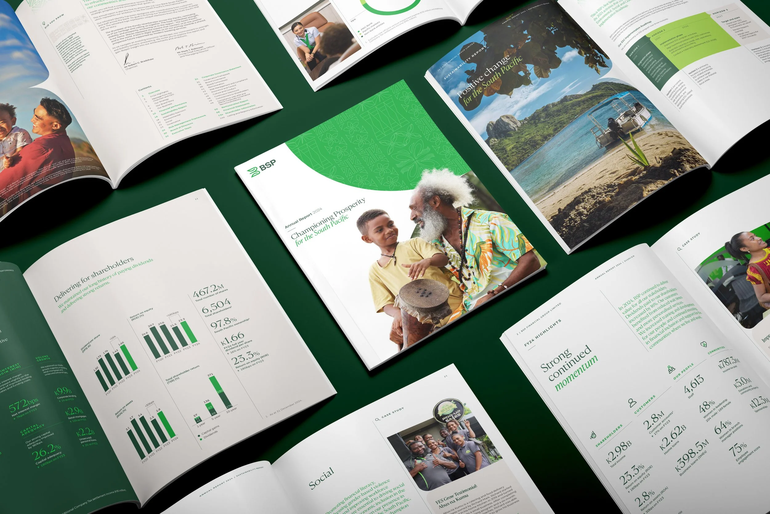
Annual report concepts and campaign rollout
Auditing of existing collateral and providing strategic design solutions to maximise efficiencies and support future growth
Website Q&A testing and oversight support
I led the audit of existing ATM screens which identified inconsistencies in brand treatment, information hierarchy, and overall lack of structure. 400+ new functional and marketing screens were delivered in English and Pidgin, alongside a digital template for BSP’s in-house designers.
I led the development of various guidelines for both BSP and BSP Life across brand, signage, uniforms, merchandise, brochures and other internal documents. These were presented to the in-house designers in a brand handover session to ensure internal alignment and understanding.
I defined a new hierarchical system and content modules for BSP’s documents to establish clear information hierarchy, improve communication and reinforce credibility through structure.
Campaign TVC produced in collaboration with Woodshed featuring anthem crafted by Dr Igelese Ete.
Details
Project
Impact
Transformed a dense, fragmented experience into a structured, navigable system
Enabled clearer communication of multi-layered products and services
Established a scalable design foundation for ongoing growth
Repositioned BSP as a more contemporary, future-focussed firm
Studio
Sodali & Co, Brand & Design
Scale
17 months spent on the project
40+ people on the project
Creative Team
Creative Direction — Andrew Nobbs
Client Services — Sim Miletic
Brand Strategy — Justin Leon
Design — Michelle Jin (Brand lead), Karina Huang (Web lead)
Illustration — Tim Heyer
Motion — Ben Holden
Website Development — Code Brewery
Campaign Production — Woodshed
Awards
Transform Awards ANZ 2025
GOLD | Best visual identity from the financial services sector
Transform Awards ANZ 2025,
SILVER | Best use of audio branding
Transform Awards ANZ 2025,
SILVER | Best brand development project to reflect a change of mission, values or positioning