Project
Role
Lead designer, illustrator
Sector
Marketing
Category
Brand identity
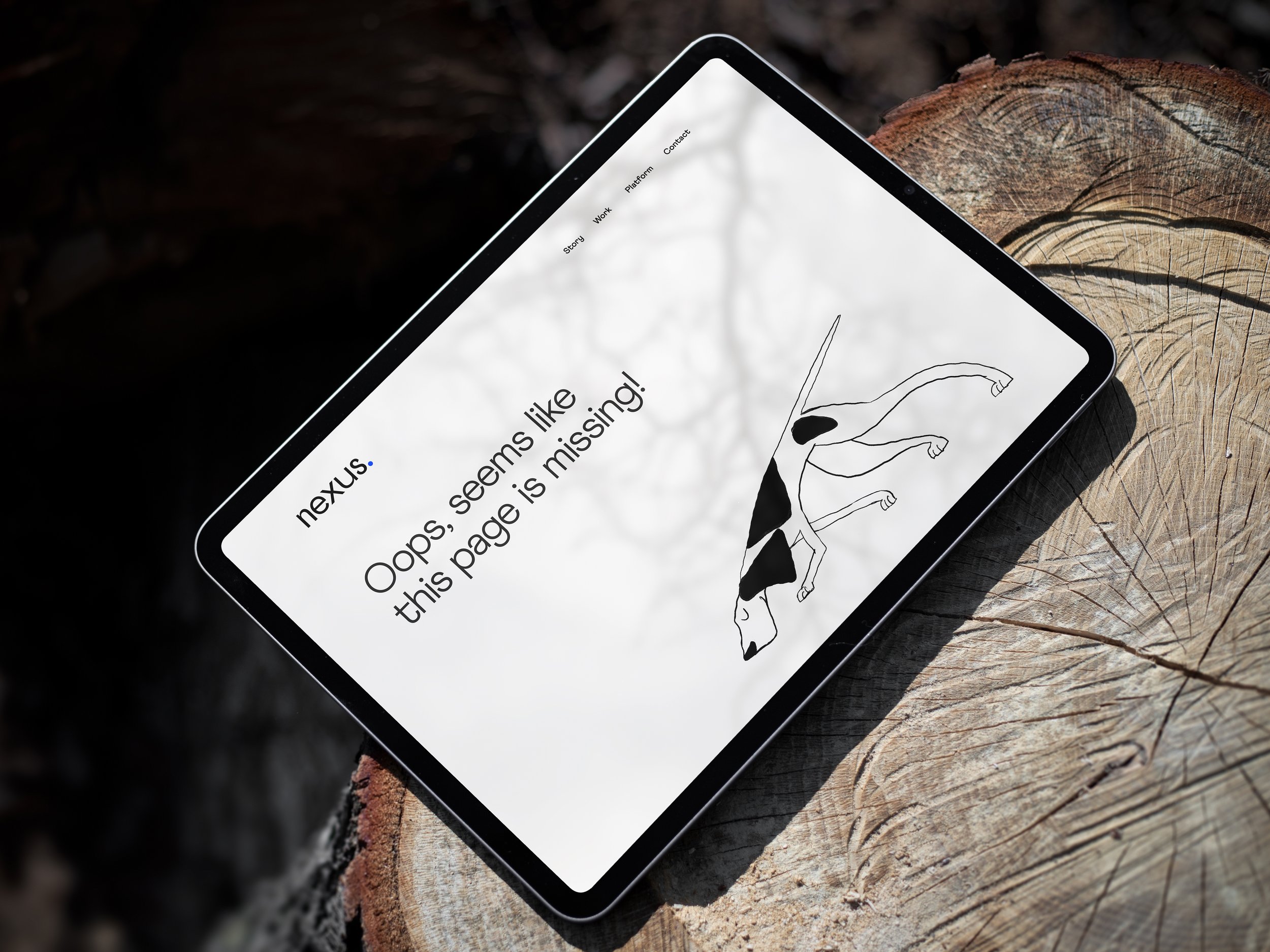
Nexus
Nexus (formerly Content Works) is a fully integrated marketing agency launched by Aspermont, a leading media services provider to the global resources sector. The existing brand lacked clarity and differentiation, making it difficult to communicate their unique positioning with topic experts writing content and a distribution network to hit the relevant target audience. The challenge was to create distinction without relying on visual noise – balancing restraint with enough character to feel recognisable with a strong storytelling narrative.
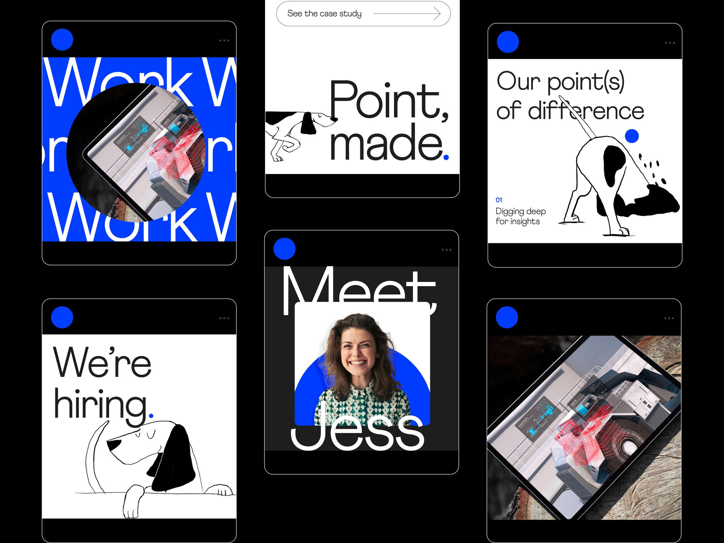
Personality with restraint
The Approach
The marketing agency space is often visually overloaded. Many identities rely on expressive visuals or trend-driven aesthetics to signal creativity, often at the expense of clarity and positioning. It was clear that Nexus’ strength wasn’t just in content creation, but in their ability to distil complex, technical ideas into clear, compelling narratives. This led to the central idea: value lies in finding and communicating “the point.”
The identity focuses on clarity, precision, and connection to audience with:
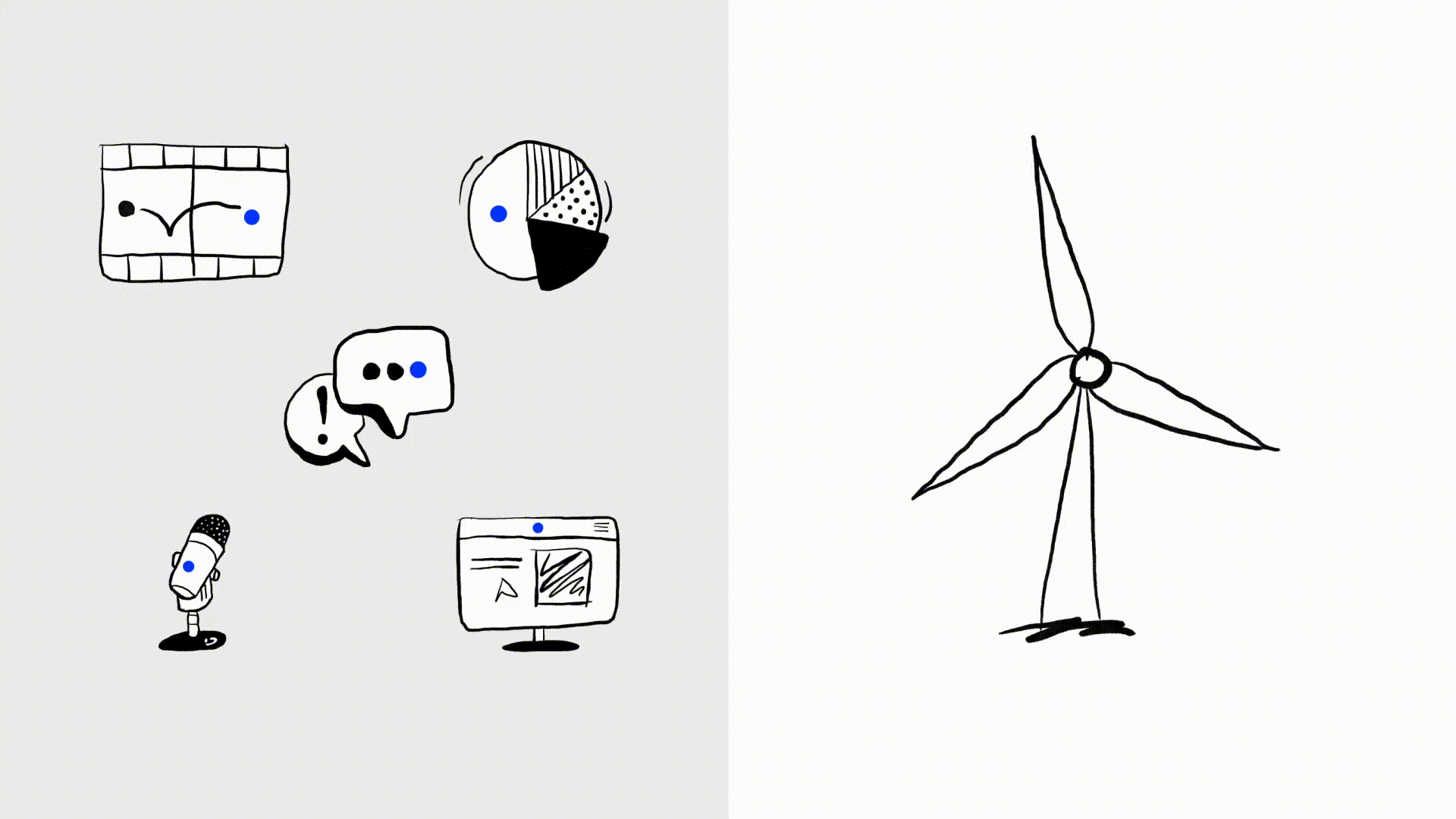
A deliberately minimal visual system that ensures messaging remains the hero
A brand mascot, Pointer, to bring charm and memorability, inspired by the Pointer breed known for seeking out and uncovering
An intentionally imperfect illustration style for distinctiveness and approachability that extends into a wider set of visual metaphors, reinforcing the idea of uncovering “the point”
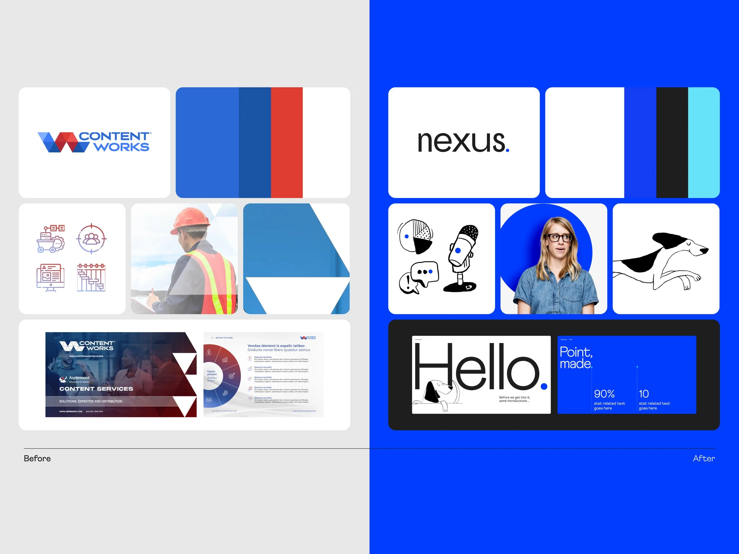

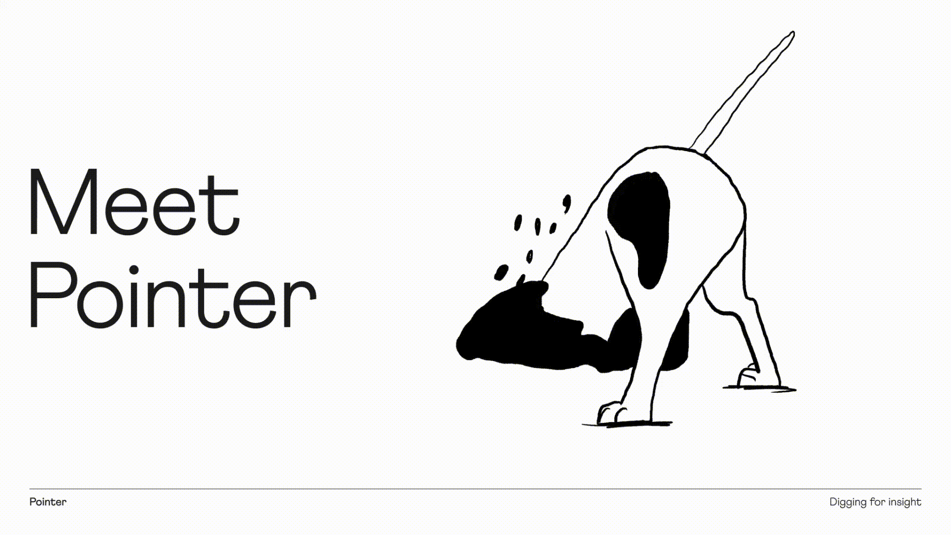
I led the development of the illustration style and final illustrations, including conceptual ideas on how Pointer could be brought to life in execution.
My Role
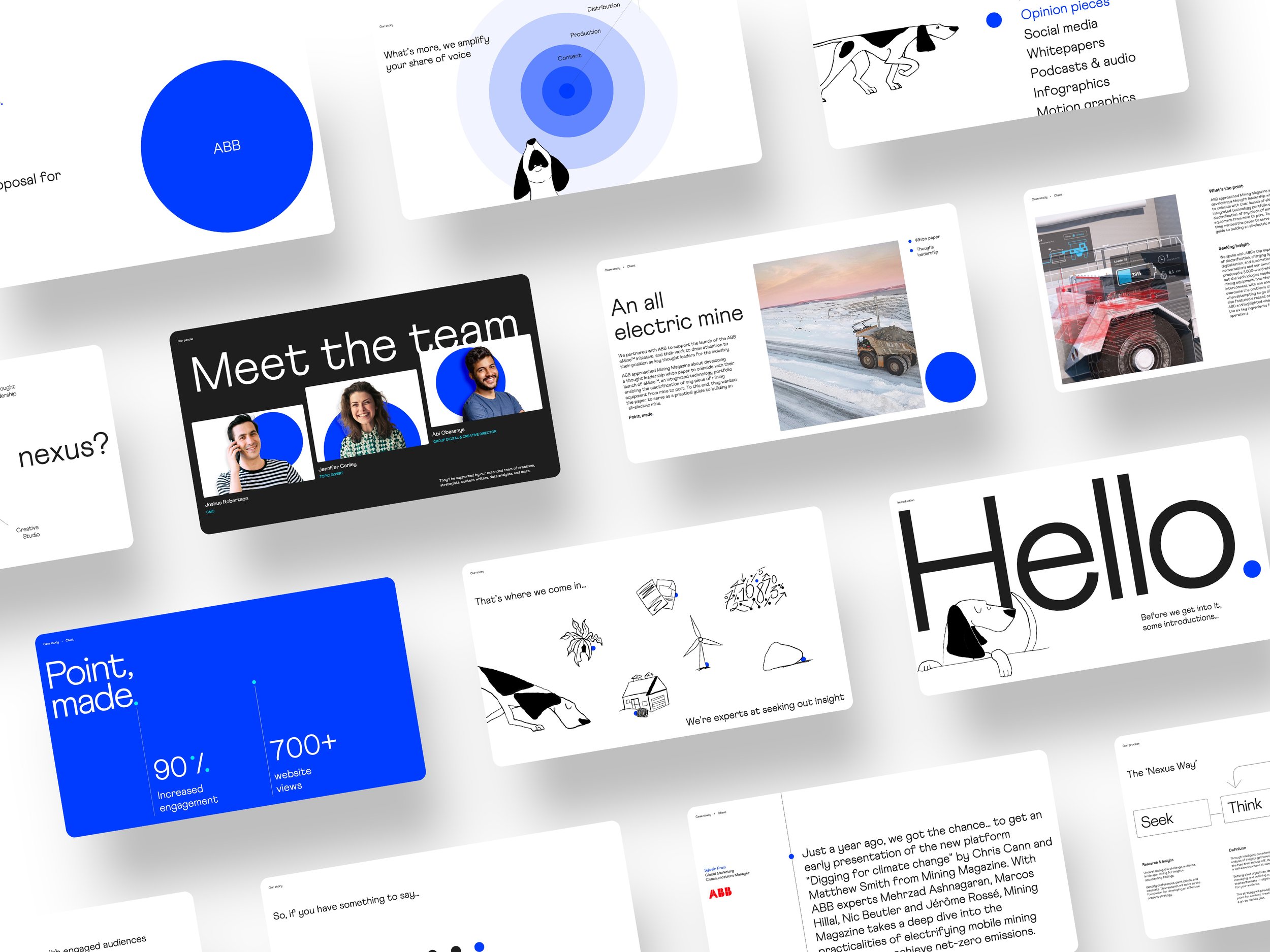
As lead designer, I drove the creative direction from early concept development through to final delivery. I led the development of the chosen brand direction, refined the visual and conceptual system, and ensured consistency across all touchpoints. This included delivering a comprehensive brand toolkit, detailed guidelines, presentation templates, and a scalable illustration system.

Details
Project
Impact
Established a scalable illustration style that pushes a strong storytelling narrative
Transformed a disjointed identity to a restrained brand that allows for clarity in communication
Created a scalable brand foundation across all touchpoints
Studio
SomeOne Sydney
Creative Team
Creative Direction — Tom Dabner
Client Services — Rebecca Bosustow
Brand Strategy — Tom Dabner
Design — Michelle Jin (Lead), Tom Dabner, Julien Bertouille
Illustration — Michelle Jin
Motion — Tom Dabner