Project
Role
Lead designer
Sector
Disability support
Category
Brand identity
Website design
Great Mates
Great Mates operates in a category often defined by clinical language, rigid systems, and transactional care. To truly differentiate, they needed to move beyond the conventions of disability support and reframe what their service represents – not just care, but connection, independence, and a sense of belonging. The challenge was to create a brand that could break category norms and reflect a more human, community-driven model of support.
Connection as interaction
The Approach
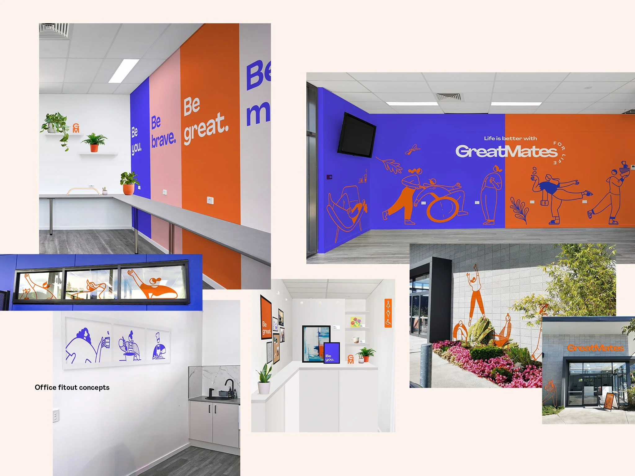
Brands in the community and support sector often fall into predictable patterns, either highly institutional or overly softened and generic. At the core of Great Mates is not just care, but mutual support. Rather than representing connection as something static or symbolic, the opportunity was to express it as something ongoing and active. This led to the central idea: connection as interaction. It celebrates the everyday and extraordinary moments that define real relationships with a bold and expressive visual system that feels joyful, inclusive and distinctively un-clinical through:
A set of graphic elements that behave relationally rather than independently
Layout structures that emphasise proximity, connection, and hierarchy
A typographic approach that prioritises clarity and accessibility
A restrained but warm colour palette to support tone without overwhelming content


My Role
This project reinforced the need to balance warmth with clarity – creating a brand that feels human without losing credibility. I led the project end-to-end, from initial strategy and concept development through to final delivery. This included defining the brand positioning, developing the creative direction, and overseeing execution across all touchpoints, including the website. I also managed the design and delivery process, ensuring alignment between strategy, creative output, and implementation.
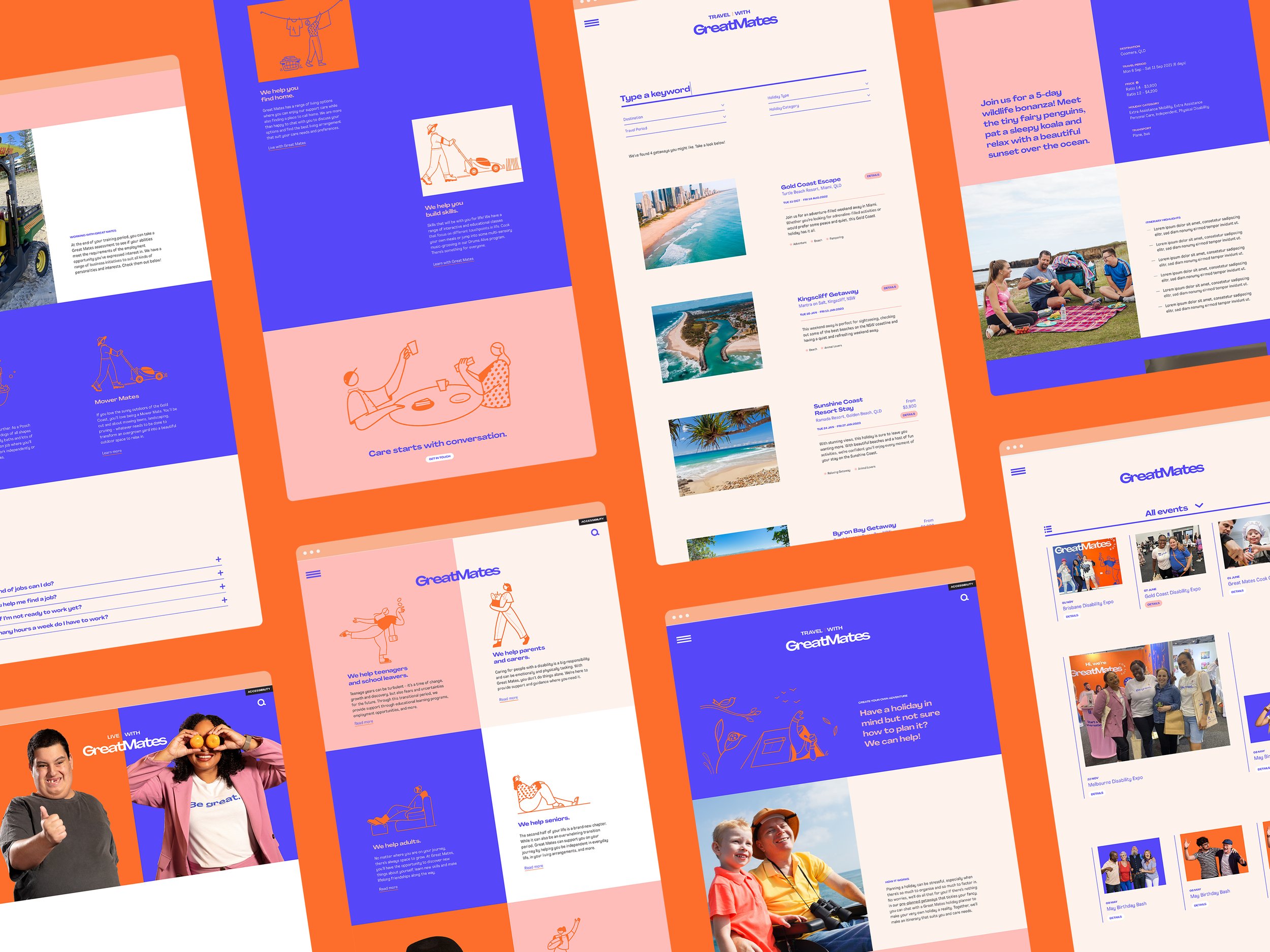
I led the development of the website from sitemap and wireframes through to design and delivery, ensuring the brand experience was maintained in a digital capacity. Part of this process included establishing tone of voice principles and copywriting.


Details
Project
Impact
Shifted the brand from generic “friendly” aesthetics to a more intentional and structured expression of connection
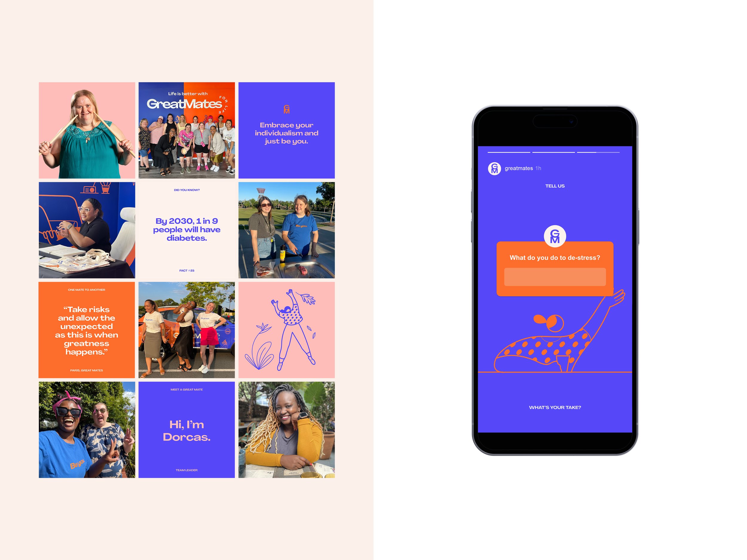
Built a flexible identity system that scales across diverse communications while maintaining consistency
Balanced emotional warmth with professional credibility, strengthening trust across audiences
Translated an abstract value (mateship) into a functional design system that has led to business growth and expansion
Studio
Percept Brand Design
Creative Team
Creative Direction — Brent Woods
Client Services — Rebecca Bosustow
Brand Strategy — Michelle Jin
Copywriting — Michelle Jin
Design — Michelle Jin (Lead)
Illustration — Ilana Bodenstein
Motion — Karina Huang, Michelle Jin
Website Build — Ryan Stroh
Awards
AGDA Awards 2021
Distinction | Design For Good / Social & Community