Project
Role
Lead designer, illustrator
Sector
Health technology
Category
Brand identity
Magentus
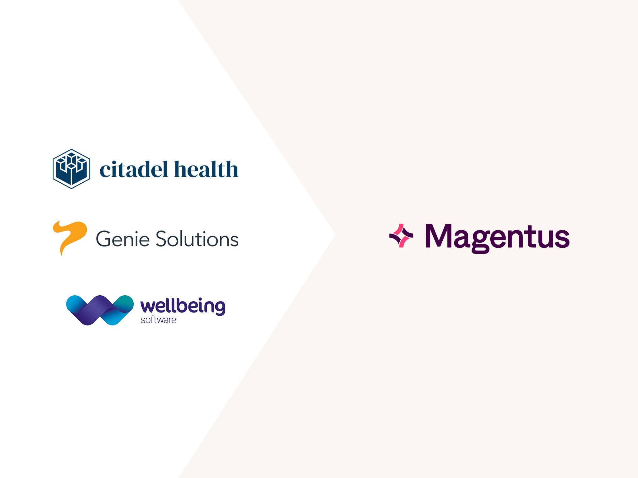
Magentus is a healthcare technology company delivering clinical software and data infrastructure across complex medical environments. Having grown through acquisition, this resulted in a fragmented brand landscape with multiple organisations operating in silos, creating inconsistency across products and touchpoints. The challenge was to bring structure to complexity – aligning the organisation under a single, scalable brand system to support their ambition for international growth.
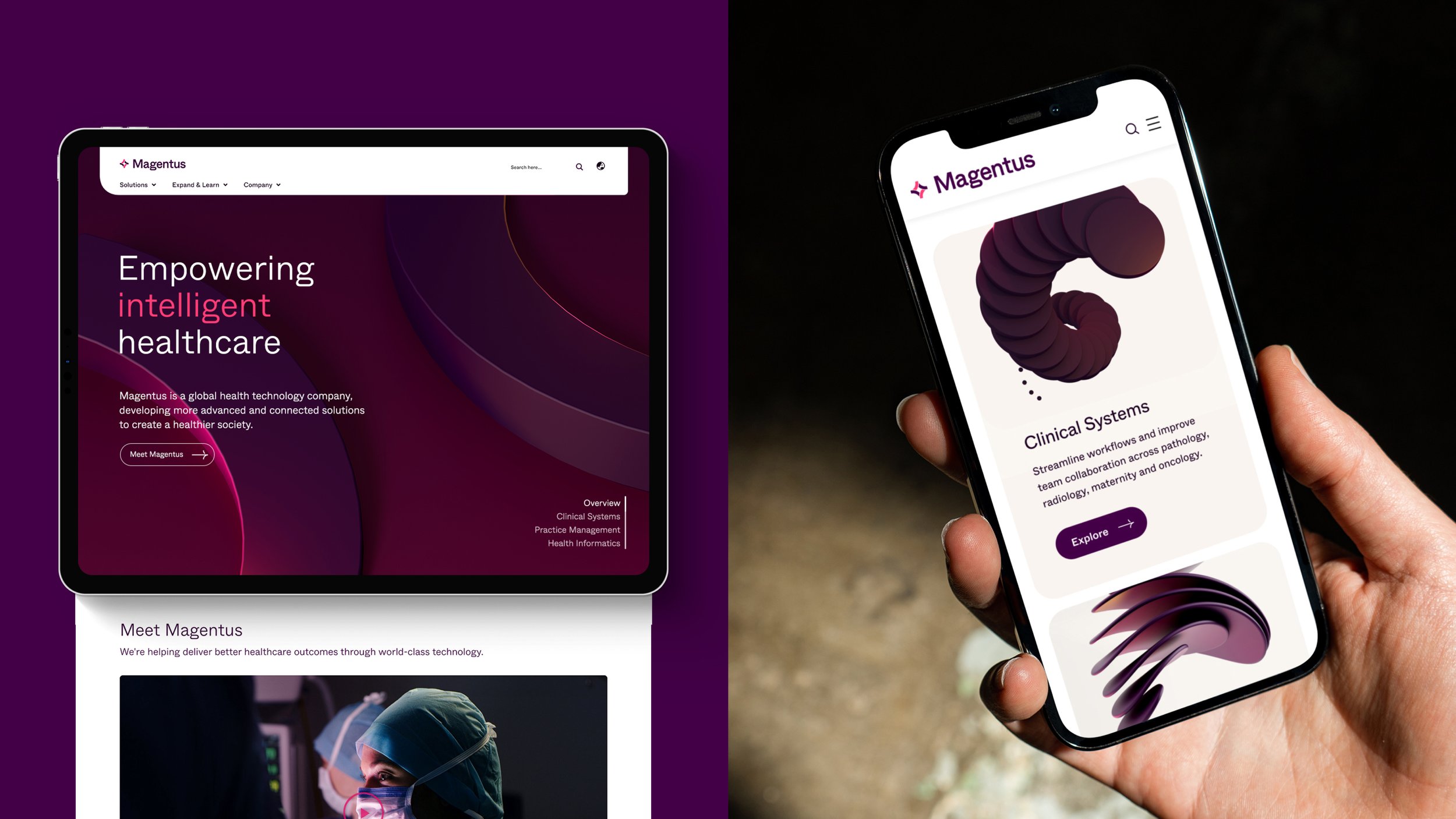
Empowering intelligent healthcare
The Approach
Positioned as a “guiding light in healthcare”, the brand reflects the scale and critical nature of their offering. Visual reduction was applied deliberately to ensure information – not decoration – remains primary, communicating trust, precision, and clarity within a highly regulated and information-dense sector through:
A unified design framework for coherence across multiple products, services, and channels
Clear hierarchy and restrained layout systems to reduce ambiguity and improve legibility across complex information
Magenta-led colour for distinctiveness and warmth
Tactile 3D forms representing technical capability
Human-centric imagery to reflect care and real-world impact

I led the development of the 3D forms, working closely with the 3D artist on the final forms depicting brand attributes and product icons.

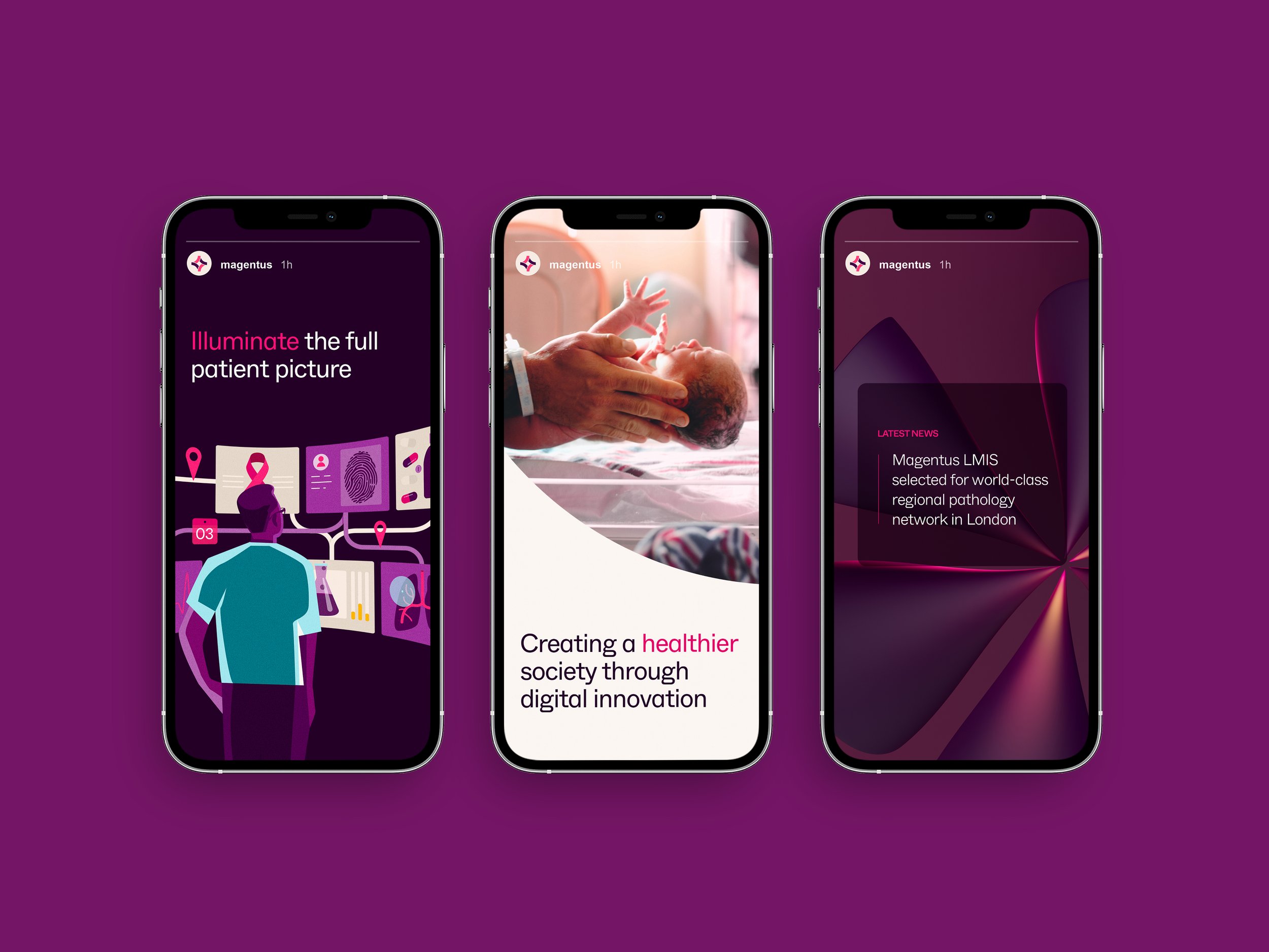
There was a strong desire from the client to implement a photography treatment. I established the art direction and visual treatment, incorporating a warm magenta tone into the lighting of photography.

My Role
This project demonstrates how design systems function in high-trust, high-complexity environments. Rather than relying on visual expression, the identity is built on structure, hierarchy, and consistency – ensuring that clarity becomes the primary mode of communication. In healthcare, design is not decorative; it is operational. This system reflects that responsibility.
As lead designer, I drove the visual direction across the identity system, with a focus on scalability and consistency. I led the development of the iconography and 3D forms, defined the photography art direction and visual treatment, and the illustration approach. Acting in a design director capacity, I co-ordinated freelancers and external partners, and worked closely with stakeholders to guide the brand through its initial rollout.
I led the illustration development, from initial sketch concepts through to final delivery.
I directed the development and implementation of the digital guidelines, overseeing the brand principles to ensure seamless handover from agency to client.


Details
Project
Impact
Established a cohesive identity system for a complex healthcare technology organisation
Improved clarity and consistency across fragmented communication environments
Positioned Magentus as a structured, reliable, and system-driven healthcare technology brand
Created a scalable visual framework capable of supporting long-term enterprise use
Studio
SomeOne Sydney
Creative Team
Creative Direction — Tom Dabner
Client Services — Rebecca Bosustow
Designers — Michelle Jin (Lead), Tom Dabner, Julien Bertouille
Illustration — Michelle Jin
3D Art & Motion — Alex Johnson
Awards
Transform Awards ANZ 2023
GOLD | Best naming strategy (New name)
Transform Awards ANZ 2023
GOLD | Best visual identity (Healthcare & Pharmaceuticals)
Transform Awards ANZ 2023
SILVER | Best use of a visual property