Project
Role
Lead designer
Sector
Consultancy
Category
Website design
TSA Riley
TSA Riley, an independent project consultancy, was formed from the merger of TSA Management and Henry Riley. Following their rebrand, the existing website no longer reflected the new brand or the people-first culture that defines their work. The challenge was to create a website that inspires confidence in clients while attracting top talent, communicating expertise, collaboration, and culture with clarity.
Impact made real
The Approach
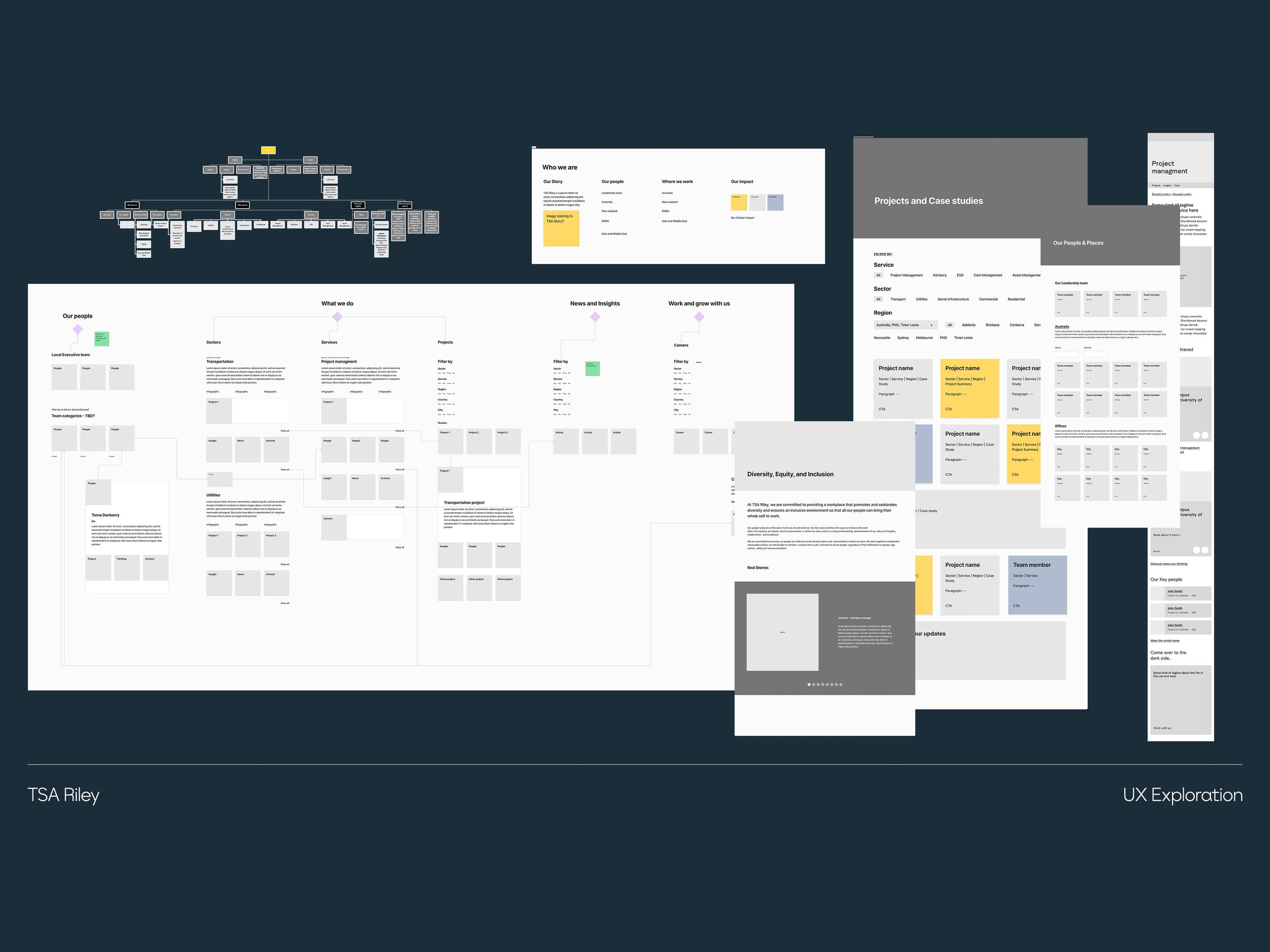
The website was designed as a structured digital experience that translates TSA Riley’s complex service offering into a clear, navigable, and credible interface. The focus was on improving information hierarchy, simplifying decision pathways, and ensuring consistency across a highly layered content structure through:
Reframing the site architecture to clearly organise TSA Riley’s services across the full project lifecycle, improving clarity and discoverability
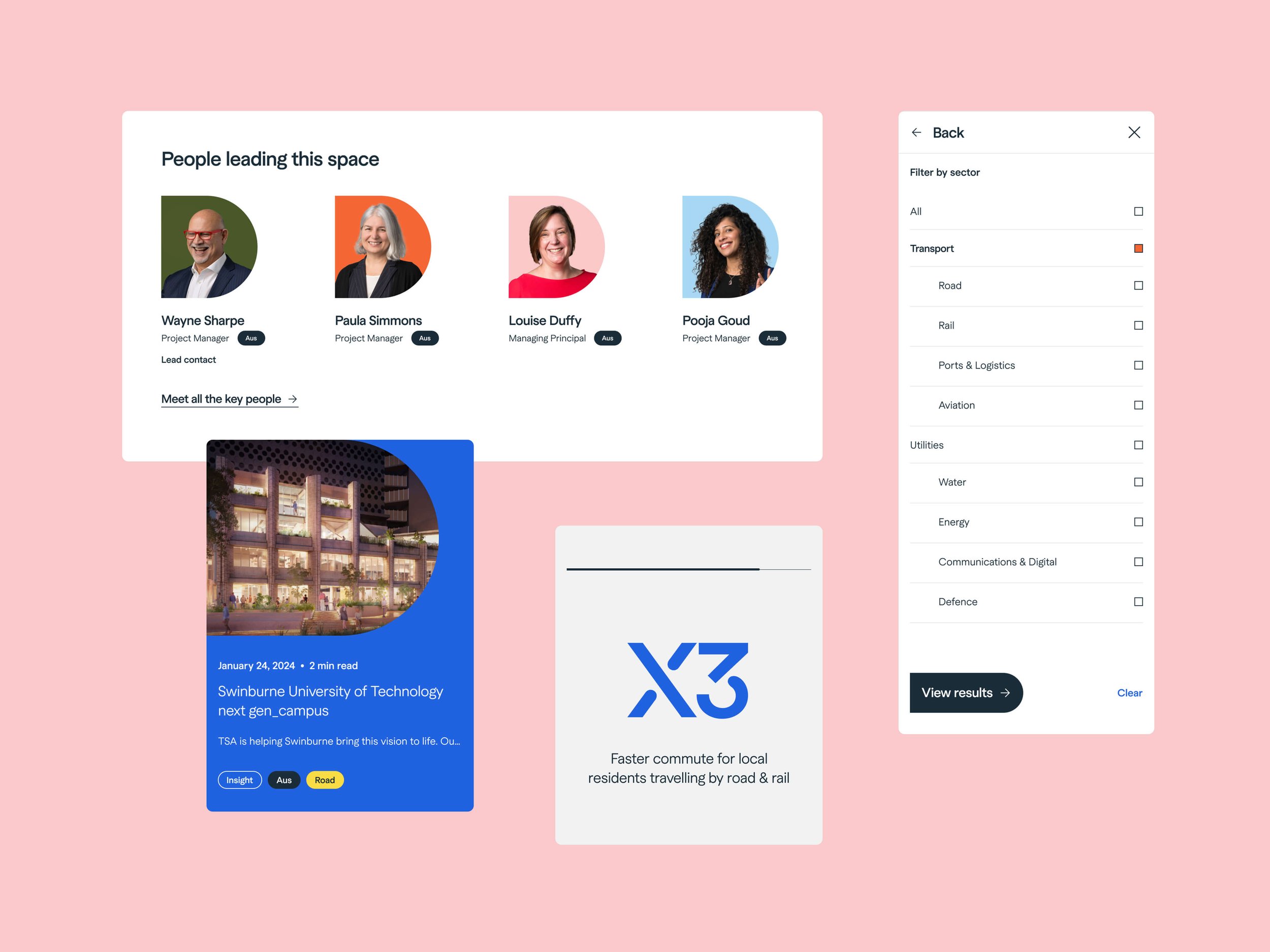
Designing a modular content system that allows complex information to be broken into digestible, scannable sections without losing depth
Establishing a clear visual hierarchy that prioritises user needs, guiding audiences through services, capabilities, and case studies with minimal friction
Applying the existing brand system in a restrained, functional way to reinforce credibility while keeping focus on content and usability
Creating a scalable UI system to ensure consistency across pages and support future content expansion


My Role
I led the end-to-end design of the website, with a focus on translating the brand system into a functional digital experience. This included shaping interface layout decisions, refining information hierarchy, and applying the design system across key pages. I worked closely with internal teams to ensure consistency and alignment between structure, content, and visual execution across the platform within a tight timeline.

Details
Project
Impact
Improved clarity of TSA Riley’s service offering by restructuring complex information into a more intuitive and navigable digital experience
Enhanced user understanding through clearer hierarchy and modular content design
Strengthened trust and credibility by translating the brand system into a consistent, engaging web presence
Created a scalable digital framework that supports ongoing content growth across services and regions
Enabled more efficient user journeys by reducing friction in how clients explore capabilities and case studies
Studio
SomeOne Sydney
Creative Team
Creative Direction — Tom Dabner
Client Services — Rebecca Bosustow
Consultant — Adam Searle
UX — Arlen McCarthy
Design — Michelle Jin (Lead), Tom Dabner, Julien Bertouille
Website Build — WP Creative